Although the TinyMCE editor in ServiceNow doesn’t support Bootstrap 3.x components directly, you can still incorporate them by editing the HTML.
While there might be slight cosmetic differences when viewing the final article in the platform, service portal, or knowledge portal, the functionality remains consistent.
I experimented with several components, and here are the ones that work reasonably well:
- Accordions/Panel Groups
- Alert Boxes
- Icons
- Tables
Let’s dive into each of these, with some screenshots to illustrate their appearance. I’ll also provide links to W3Schools for further reading on these Bootstrap components, as it’s a valuable resource for understanding and using these features.
Accordions/Panel Groups
These components allow you to create expandable panels, which open when clicked. Previously, you might have had multiple articles detailing how to perform the same task across different applications (e.g., using Outlook on Windows, Mac, or the web). Now, you can consolidate this information into a single article, enabling users to select and view only the relevant section they need.
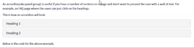
The code for this isn’t quite the same as it is in the official docs, or W3Schools, as if you use that you might find that users ‘jump’ around the page as they click on the headings.
Here’s a snippet which you can use and customise to your needs:
<div id="accordion" class="panel-group">
   <div class="panel panel-default">
      <div class="panel-heading">
         <h4 class="panel-title"><a data-toggle="collapse" href="javascript:void(0);" data-target="#panel1" data-parent="#accordion" rel="nofollow">Heading 1</a></h4>
      </div>
      <div id="panel1" class="panel-collapse collapse" aria-expanded="false">
         <div class="panel-body">
            Text Here
         </div>
      </div>
   </div>
   <div class="panel panel-default">
      <div class="panel-heading">
         <h4 class="panel-title"><a data-toggle="collapse" href="javascript:void(0);" data-target="#panel2" data-parent="#accordion" rel="nofollow">Heading 2</a></h4>
      </div>
      <div id="panel2" class="panel-collapse collapse" aria-expanded="false">
         <div class="panel-body">
            Text Here
         </div>
      </div>
   </div>
</div>
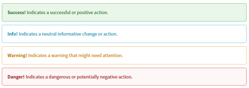
Alert Boxes
Alert boxes are invaluable for highlighting important information. You can use different colors to convey various types of messages:
- Green (Success)
- Blue (Info)
- Yellow (Danger)
- Red (Warning)
The code for these is very simple:
<div class="alert alert-success"><strong>Success!</strong> Indicates a successful or positive action.</div>
Simply change the class where it says alert-success to the colour you want (alert-info, alert-warning, alert-danger). Anything in-between the div tags will be shown in the alert box.
Alert boxes can also be combined with icons (see below for more information), for example:

For more information, visit https://www.w3schools.com/bootstrap/bootstrap_alerts.asp
Icons
Bootstrap Glyphs can be used in articles. For example:
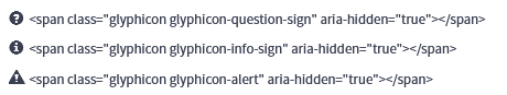
I’d recommending putting a space ( ) in the code after an icon, just to help space the text that comes after it. A full list of icons can be found at https://www.w3schools.com/icons/bootstrap_icons_glyphicons.asp
If you’re feeling adventurous, you can also do things like adding the icons to buttons:
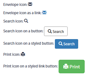
<p>Envelope icon: <span class="glyphicon glyphicon-envelope"></span></p>
<p>Envelope icon as a link: <a href="#"> <span class="glyphicon glyphicon-envelope"></span></a></p>
<p>Search icon: <span class="glyphicon glyphicon-search"></span></p>
<p>Search icon on a button: <button type="button" class="btn btn-default"> <span class="glyphicon glyphicon-search"></span> Search </button></p>
<p>Search icon on a styled button: <button type="button" class="btn btn-info"> <span class="glyphicon glyphicon-search"></span> Search </button></p>
<p>Print icon: <span class="glyphicon glyphicon-print"></span></p>
<p>Print icon on a styled link button: <a href="#" class="btn btn-success btn-lg"> <span class="glyphicon glyphicon-print"></span> Print </a></p>
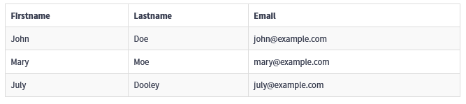
Tables
By using some of the built-in Bootstrap classes, you can enhance the appearance of your tables and add useful features such as borders and row highlighting.
Always start by adding the table class to your table. Then, you can include additional classes like table-striped and/or table-bordered to apply those specific features:
table
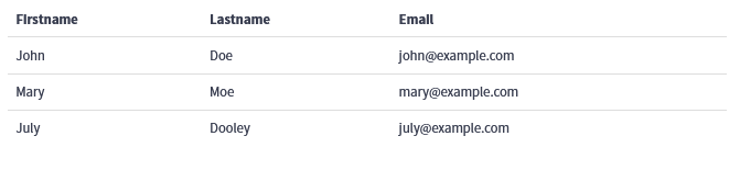
table table-striped
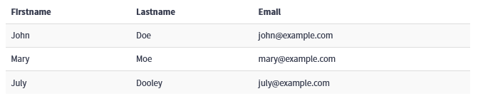
table table-bordered
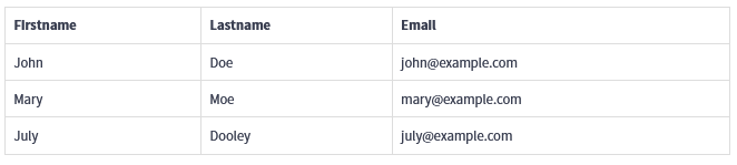
table table-striped table-bordered
For more information visit https://www.w3schools.com/bootstrap/bootstrap_tables.asp
Wrapping Up
By leveraging these Bootstrap 3.x components in your ServiceNow knowledge articles, you can significantly enhance both the functionality and aesthetics of your content. Whether you’re using accordions to consolidate information, alert boxes to highlight key points, icons to add visual interest, or tables to organize data, these tools can make your articles more engaging and user-friendly.
I hope you find these tips and examples helpful as you create and refine your own knowledge articles. For more detailed information on Bootstrap components, be sure to check out the resources on W3Schools.
Thank you for reading! If you have any questions or additional tips to share, feel free to leave a comment below.
Happy styling!


