Before the launch of our IT Service Portal, we used a wizard within our “Report a Fault” process. This wizard aimed to provide deflection by guiding users through the following steps:
- Active P1 Calls: Users were shown a list of active P1 calls to which they could log a child call (visibility was set through a tickbox on the incident form).
- Active User Calls: Users could see a list of their active calls, encouraging them to update existing issues rather than logging new ones.
- Bespoke Fault Record Producers: A table displayed various bespoke ‘report a fault’ record producers (again, a custom tickbox on the record producers determines if they were displayed to users).
When we transitioned to the service portal, a colleague initially replicated this process on a single portal page.

While this setup worked well initially, we discovered that some users ignored the page content and directly clicked on the option to report a new fault located in the bottom right corner.
Improving the User Experience
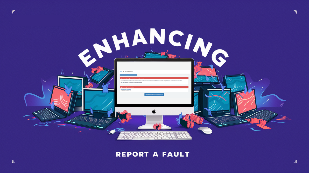
To address this, I decided to replicate the old wizard functionality while enhancing the look and feel. New portal pages with custom widgets were created to guide users through the following steps:
High Priority Calls: Users are shown a list of all active high priority calls (not just P1s), determined by our Service Desk using the tickbox on the incident form. Clicking on these allows users to log incidents as child calls.

Active Incidents: If users are not affected by the high priority calls, they are shown a list of their active incidents. This list automatically skips after a few seconds if there are no active incidents.

Fault Report Record Producers: Users see a grid of our bespoke fault report record producers, designed similarly to the out-of-the-box catalog widgets. If their fault is not listed, a button at the bottom directs them to a generic record producer.

Additional Safeguards
Despite these improvements, users could still bypass the process to reach the generic report a fault form. To mitigate this, I leveraged the browser’s session storage to track if users went through the entire process or jumped in midway (e.g., via a bookmarked page). If users bypassed steps, they were redirected to the first step to ensure they followed the proper process.
This approach not only streamlined our fault reporting but also improved user engagement and accuracy, making the system more efficient for both users and the service desk team.
Customer Feedback
We asked some of our customers to compare the original and new processes. Here’s some quotes from our users on the original:
“easy to just ignore it all and skip”
“Too easy to report without considering whether it is an existing problem.”
“I think is good to have all in one page, but not all users will read the instructions which may lead to confusion, duplicates, etc.”
Feedback on the new pages:
“It presents less information at a time, which should hopefully encourage people to use it.”
“Wizard approach is good. More visually appealing”
“I like the guided experience.”
“It clearly shows me key services and allows me to chase my open incidents easier than before”
“Much easier to use on a mobile device and clear in terms of steps a person needs to go through.”
“This is great! So much clearer than the older version”
That’s it for this blog post, thanks for reading!
Stay tuned for more insights and updates on our continuous improvement efforts.


